Thank you to ResearchFish, a system that many UK researchers are
required to use to report their research outcomes, for providing a rich set of
examples of user experience bloopers. Enjoy! Or commiserate...
 * The ‘opening the box’ experience: forget any idea that people have
goals when using the system (in my case, to enter information about
publications and other achievements based on recent grants held): just present
people with an array of options, most of them irrelevant. If possible, hide the
relevant options behind obscure labels, in the middle of several irrelevant
options. Ensure that there is no clear semantic groupings of items. The more
chaotic and confused the interaction, the more of an adventure it’ll be for the
user.
* The ‘opening the box’ experience: forget any idea that people have
goals when using the system (in my case, to enter information about
publications and other achievements based on recent grants held): just present
people with an array of options, most of them irrelevant. If possible, hide the
relevant options behind obscure labels, in the middle of several irrelevant
options. Ensure that there is no clear semantic groupings of items. The more
chaotic and confused the interaction, the more of an adventure it’ll be for the
user.
* The conceptual model: introduce neat ideas that have the user
guessing: what’s the difference between a team member and a delegate? What
exactly is a portfolio, and what does it consist of? Users love guesswork when
they’re trying to get a job done.
* Leave some things in an uncertain state. In the case of
ResearchFish, some data had been migrated from a previous system. For this
data, paper titles seem to have been truncated and many entries only have one
page number. For example. Data quality is merely something to aspire to.
* Leave in a few basic bugs. For example, there was a point when I
was allegedly looking at page 6 of 8, but there was only a ‘navigate back’
button: how would I look at page 7 of 8? [I don’t believe page 7 existed, but
why did it claim that there were 8 pages?]
* If ‘slow food’ is good, then surely ‘slow computing’ must be too:
every page refresh takes 6-8 seconds. Imagine that you are wading through
treacle.
* Make it impossible to edit some data items. Even better: make it
apparently a random subset of all possible data items.
* Don’t present data in a way that makes it clear what’s in the
system and what might be missing. That would make things far too routine. Give
the system the apparent structure of a haystack: some superficial structure on
the outside, but pretty random when you look closer.
* Thomas Green proposed a notion of ‘viscosity’ of a system: make
something that is conceptually simple difficult to do in practice.
One form of viscosity is ‘repetition viscosity’. Bulk uploads? No way! People
will enjoy adding entries one by one. One option for adding a publication entry
is by DOI. So the cycle of activity is: identify a paper to be added; go to
some other system (e.g., crossref); find the intended paper there; copy the
DOI; return to ResearchFish; paste the DOI. Repeat. Repeatedly.
* Of course, some people may prefer to add entries in a different
way. So add lots of other (equally tedious) alternative ways of adding entries.
Keep the user guessing as to which will be the fastest for any given data type.
* Make people repeat work that’s already been done elsewhere. All my publications
are (fairly reliably) recorded in Google Scholar and in the UCL IRIS system. I
resorted at one point to accessing crossref, which isn’t exactly easy to use
itself. So I was using one unusable system in order to populate another
unusable system when all the information could be easily accessed via various
other systems.
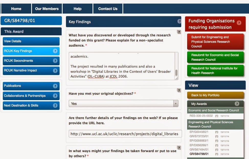
 * Use meaningless codes where names would be far too obvious. Every
publication has to be assigned to a grant by number. I don’t remember the
number of every grant I have ever held. So I had to open another window to
EPSRC Grants on the Web (GOW) in order to find out which grant number
corresponds to which grant (as I think about it). For a while, I was working from
four windows in parallel: scholar, crossref, GOW and ResearchFish. Later, I
printed out the GOW page so that I could annotate it by hand to keep track of
what I had done and what remained to be done. See Exhibit A.
* Use meaningless codes where names would be far too obvious. Every
publication has to be assigned to a grant by number. I don’t remember the
number of every grant I have ever held. So I had to open another window to
EPSRC Grants on the Web (GOW) in order to find out which grant number
corresponds to which grant (as I think about it). For a while, I was working from
four windows in parallel: scholar, crossref, GOW and ResearchFish. Later, I
printed out the GOW page so that I could annotate it by hand to keep track of
what I had done and what remained to be done. See Exhibit A.
* Tax the user’s memory: I am apparently required to submit entries
for grants going back to 2006. I’ve had to start up an old computer to even
find the files from those projects. And yes, the files include final reports
that were submitted at the time. But now I’m expected to remember it all.
* Behave as if the task is trivial. The submission period is 4 weeks.
A reminder to submit was sent out after two weeks. As if filling in this data
is trivial. I reckon I have at least 500 outputs of one kind or another. Let’s say 10 minutes per output (to
find and enter all the data and wait for the system response). Plus another
30-60 minutes per grant for entering narrative data. Yay: two weeks of my life
when I am expected to teach, do research, manage projects, etc. etc. too. And that assumes that it’s easy to organize
the work, which it is not. So add at least another week to that estimate.
 * Offer irrelevant error messages: At one point, I tried doing a
Scopus search to find my own publications to enter them. Awful! When I tried
selecting one and adding it to my portfolio, the response was "You are not
authorized to access this page.” Oh: that was because I had a break between
doing the search and selecting the entry, so my access had timed out. Why
didn’t it say that?!?
* Offer irrelevant error messages: At one point, I tried doing a
Scopus search to find my own publications to enter them. Awful! When I tried
selecting one and adding it to my portfolio, the response was "You are not
authorized to access this page.” Oh: that was because I had a break between
doing the search and selecting the entry, so my access had timed out. Why
didn’t it say that?!? * Prioritise an inappropriate notion of security over usability: the security risk of leaving the page unattended was infinitesimal, while the frustration of time-out and lost data is significant, and yet researchfish timed out in the time it took to get a cup of coffee. I suspect the clock on the researchfish page may have been running all the time I was using the Scopus tool, but I'm not sure about that, and if I'm right then that's a crazy, crazy was to design the system. This kind of timeout is a great way of annoying users.
* Minimise organization of data: At one point, I had successfully found
and added a few entries from Scopus, but also selected a lot of duplicate
entries that are already in Researchfish. There is no way to tell which have
already been added. And every time the user tries to tackle the challenge a
different way it’s like starting again because every resource is organized
differently. I have no idea how I would do a systematic check of completeness
of reporting. This is what computers should be good at; it’s unwise to expect
people to do it well.
* Sharing the task across a team? Another challenge. Everything is
organised by principal investigator. You can add team members, but then who
knows what everyone else is doing? If three co-authors are all able to enter
data, they may all try. Only one will succeed, but why waste one person’s time
when you can waste that of three (or more) people?
* Hide the most likely option. There are several drop-down menus
where the default answer would be Great Britain / UK, but menu items are
alphabetically ordered, so you have to scroll down to state the
basically-obvious. And don’t over-shoot, or you have to scroll back up again.
What a waste of time! There are other menus where the possible dates start at 1940: for reporting about projects going back to 2006. That means scrolling through over 60 years to find the most probable response.
* Assume user knowledge and avoid using forcing functions: at one
point, I believed that I had submitted data for one funding body; the screen
icon changed from “submit” to “resubmit” to reinforce this belief. But later someone
told me there was a minimum data set that had
to be submitted and I knew I had omitted some of that. So I went back and
entered it. And hey presto: an email acknowledgement of submission. So I hadn’t
actually submitted previously despite what the display showed. The system had
let me apparently-submit without blocking that. But it wasn’t a real
submission. And even now, I'm not sure that I have really submitted all the data since there is still an on-screen message telling me that it's still pending on the login page.

 *Do not support multi-tasking. When I submitted data for one funding body, I wanted to get on with entering data for the next. But no: the system had to "process the submission" first. I cannot work while the computer system is working.
* Entice with inconsistency. See the order of the buttons for each of several grants (left). Every set is different. There are only 6 possible permutations of the three links under each grant heading; 5 of them are shown here. It must take a special effort to program the system to be so creative. Seriously: what does this inconsistency say about the software engineering of the system?

* Add enticing unpredictability. Spot the difference between the two screen shots on the right. And then take a guess at what I did to cause that change. It took me several attempts to work it out myself.
I started out trying to make this blog post light-hearted, maybe even amusing. But these problems are just scratching the surface of a system that is fundamentally unusable. Ultimately I find it really depressing that such systems are being developed and shipped in the 21st Century. What will it take to get the fundamentals of software engineering and user experience embedded in systems development?
Fantastic summary of a system that is not fit for purpose
ReplyDeleteThere are 100s, 1000s of researchers across the UK sharing this pain. This system is not fit-for-purpose. To compound the difficulties the system is being modified as we trying to use it. I managed to get all the way through to submission yesterday. The final submission screen had a reminder that “By submitting this data I agree to the terms of use”. The “terms of use” phrase is shown as a hot link, but on clicking the link there no information on terms of use – the pop-up window displays the following message “NaN" height="600" frameborder="0" webkitAllowFullScreen mozallowfullscreen allowFullScreen>” Thus, by clicking the submit button we appear to be completed a quasi-legal agreement which is in effect a blank page.
ReplyDeleteAlan Archibald 7 November
I could add to the litany of problems and design flaws in the Researchfish system, but perhaps the worst outcome is that the design flaws encourage cynicism about reporting and a disregard for accuracy.
ReplyDeleteIt is a privilege to be granted public funding for research and myself and other publicly funded researchers fully accept our responsibility to report the outcomes from our research to the funders and the wider public.
In its present state Researchfish is a barrier to meeting this obligation.
Thank you for pointing this out. I agree completely. All recipients of public funds are, rightly, accountable to the public. And I'm sure most of us try to discharge that responsibility in a variety of ways. It's a pity that this tool undermines that so badly.
DeleteAll of my research outcomes are on a dedicated web page indicating the funder, and in my university's open access database. This has nothing to do with the public. It is RCUK using professors as secretaries in order to meet their own requirements to prove how well they spend money.
DeleteThere are many institutions that have invested in their own research information systems and would welcome interoperability between their CRIS and ResearchFish. The ability to bulk upload into the HEFCE submission system for REF2014 demonstrated that this is achievable so it would be good to see similar developments in RF sooner than later.
ReplyDeleteThis is, of course, an attractive option, and I believe some universities are already heading this way. I've suggested it too. Any reporting system comes with a cost. At the moment the cost is borne by the principal investigators on grants (or people they delegate to). This approach would shift much of the cost to the universities. But I would still argue that a better designed system would have reduced the cost (or maybe it would have shifted it to the funders if they invested in a system that was fit for purpose).
DeleteOther examples of difficulties received by email from a colleague:
ReplyDelete"Outputs currently assigned to this award can be viewed from this page but to add new outputs you must return to the portfolio" – why? Seeing as they have anticipated this, why not help the user? When I return to the portfolio (where I was a second ago) I'm going to have to look up my EP/xxxxx number yet again.
I put in a list of DOIs and it too so long to do anything with it, it said "You are not authorized to access this page."
Another two responses from someone who emailed me about this matter. This professor is not alone in expressing a strong emotional reaction to researchfish (writing the blog post in the first place was my way of dealing with my anger and frustration with it and others have emailed me privately about their emotional reactions to it too):
ReplyDelete1) What data the research councils ask researchers to enter:
"I was at home crying last night over the mass of data I have to re-enter [...] going back to 2002. I simply couldn't see how it could be done; like you I was trying to track down backups of long expired computers...
I have had a huge row with [funding body] today....about the fact that no data was transferred from any Je-S grant report
and they have just told me this.....after 5 days of trying to wade through data....
"Data from grant final reports have not been migrated to Researchfish. ......Please note that researchers are not required to provide Researchfish with any outcomes data that they have previously provided to [funding body]. Researchers are asked to provide information on new outcomes that have arisen since they last reported on the grant."
So I don't even need to do it....would have been good to tell us that from the start. "
2) The point of asking for ORCID information:
"I also have a response from researchFish themselves about why they ask for an ORCID number and then don’t use it for its explicit purpose of allowing bulk transfer of references. Which I think all other similar sites requesting an ORCID number do…I asked when it would be possible…..and they respond "re you making a suggestion that we do this?” isn’t that the whole point of an ORCID?"
This system sucks. I wasted many hours of my life. I am in all favor of reporting work (e.g., by uploading a .pdf file that includes everything), but I especially like actually doing it. I hate EPSRC and Researchfish.
ReplyDeleteThis is not atypical of many international research portals. The quality and functionality (not to mention usability) of the interfaces and apparent disregard for data entry processes is lamentable. We tolerate it because after a long period of time we learn the eccentricities. This isn't how interfaces should work and the problems should be embarrassing for the agencies. It is, after all, their portal and their face to a large part of their constituency. The disease is also found in manuscript upload sites for journals as well as perhaps the most brain-dead example of poor design, the Canadian Common CV. This is a required repository for many funding agencies in Canada and makes Researchfish look positively advanced. It's supposedly a ccomm CV yet every agency requires a separate format of CV and some even require multiple formats within the same agency! My only rationale for why the CCV is so disastrously bad is that it must have a proven record for diminishing the hope (and therefore pool) of investigators who decide they'd rather flip burgers than deal with such insanity.
ReplyDeleteFor those who have read this far, I am informed that:
ReplyDelete"Only the sections under "additional questions" are mandatory."
PS preview on your blog makes things disappear!
ReplyDeleteI haven't a clue why that might be happening. Other than to enhance the user experience of course: remember those fun games for 'peepo' you played when you were a toddler?!
DeleteI used a researchfish link in my email, and it opened researchfish -- but it was a one time only link, so a brief warning popped up and disappeared before I'd managed to understand it. Why a single use link? Why can't you log in more than once?
ReplyDeleteAnyway, why doesn't the recent reminder email give me a useful link: like, they know who they are sending the email to, and they are telling them to go to researchfish. So what's the first thing they want users to do? Go to researchfish! How exactly?
They have prioritised a naive idea of security over usability.
I think it's best to take a deep breath, put one's feet up and let the whole system implode on itself...
ReplyDeleteSince I no longer have any interest in getting new EPSRC grants as a PI, I did actually tell them where they could stick Researchfish and their reminders. They got very huffy and I had to threaten them with the Information Services Commissioner. EPSRC have agreed to stop harassing me but they are refusing to delete my personal details for ten years, which leaves me open to more aggravation in the future. I am still debating whether life is too short to make a formal complaint to the ISC about EPSRC's refusal to acknowledge my formal withdrawal of consent for them to hold personal information.
ReplyDeleteVery worth full content, thanks for sharing.
ReplyDeleteWeb Design company in Hubli | web designing in Hubli | SEO company in Hubli